

Everything you need within a single platform
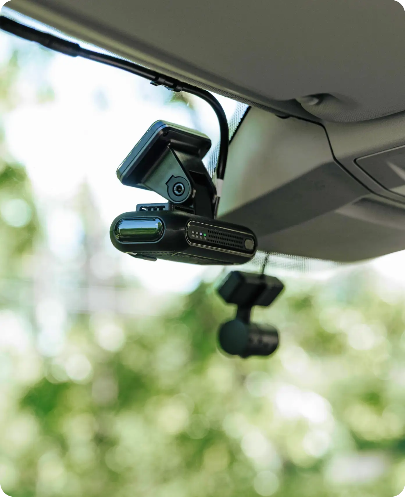
Safety and security
Make sure your drivers, vehicles, and assets are safe.
Compliance
Follow all rules, including tachograph regulations, with ease.
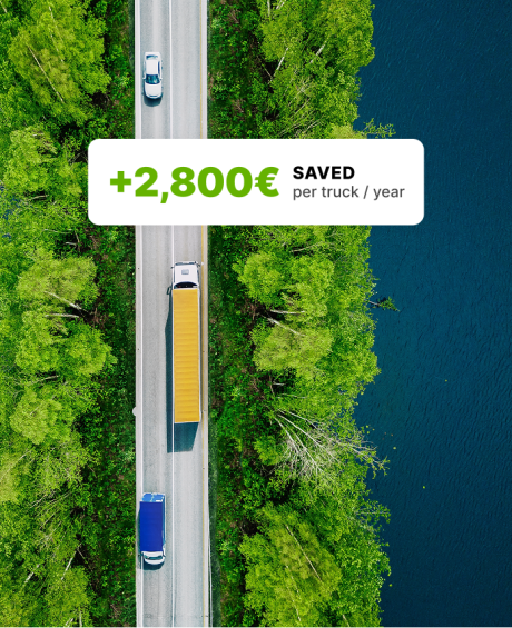
Cost optimisation
Decrease costs by optimising fuel consumption and fleet maintenance.
Process automation
Make your processes faster and remotely accessible.