Here is how we help fleet managers
19.05 Trucking


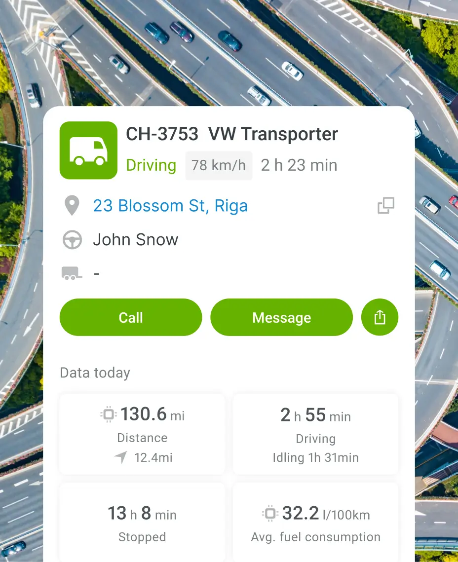
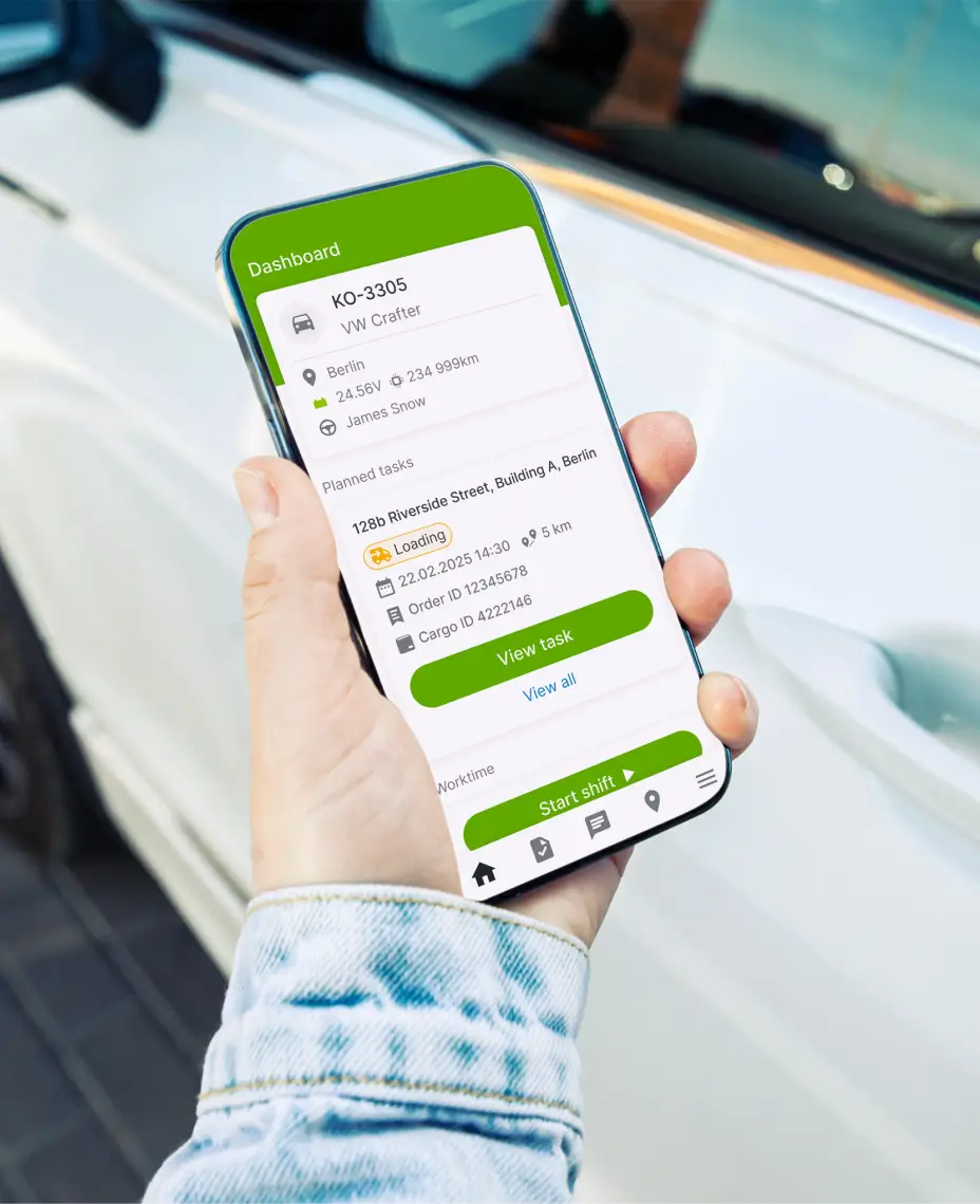
Stay connected with drivers
Monitor cargo temperature too
Monitor driver behavior on the go
Personalise alerts for your needs


What makes Mapon Manager different from other fleet apps?
What is a fleet management app?
Is Mapon Manager a free fleet app?
What features are included in Mapon Manager?
Is Mapon Manager suitable for trucking companies?
How can I improve driver management with your fleet app?
Can Mapon Manager substitute the Mapon platform?